
|
Haein Song Quiet Unmaking Un—Folded Whole Light / Folds Pain Memory Marking Colour A Brief History of... *** Advice to a Painter Laudes Creaturarum Topiary Les Climats Queen Mary's Dolls' House Winter's Tale The Fragments of Parmenides The Botanical City Ornamental Digressions Hungry Bibliophiles Interstices & Intersections Perpetua and Felicity In Principio La Prose du Transsibérien Re-creation Dickinson's Selected Poems Bram de Does Russian Modernism Beckett's Trilogy The Songlines Linear A to Linear Z A Bend in the River Mr. Palomar Journey Round My Room The Myth of Sisyphus Romeo and Juliet The Periodic Table The Trial Gogol's Collected Stories Brush Up Your Shakespeare Just So Stories Le Grand Meaulnes Whistler Don't Look Now *** Three Plays of the Absurd Nine Books of the Absurd *** About |
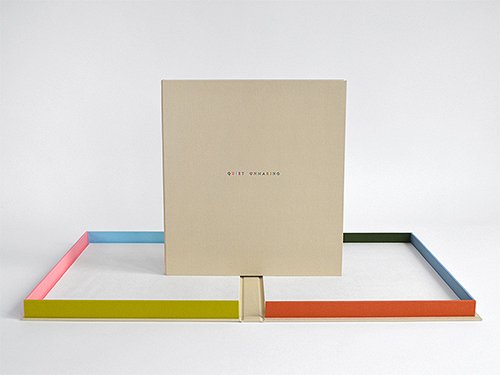 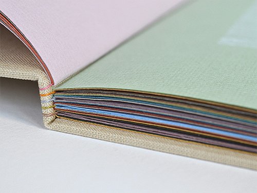 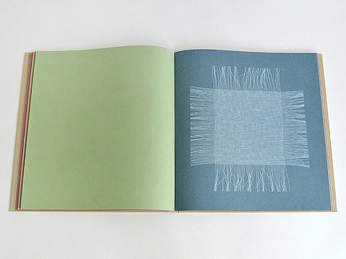 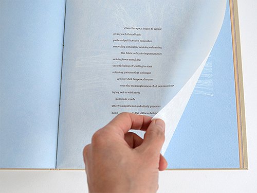 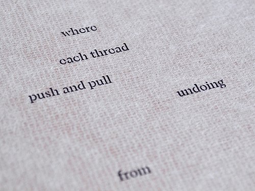 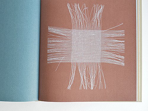 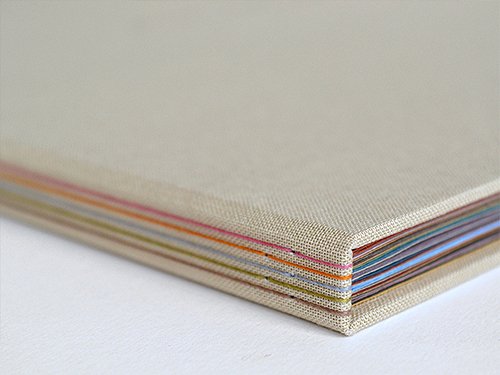 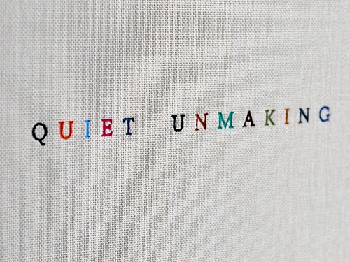 Quiet Unmaking by Haein Song Designed and printed in 2025 Bound in 2026 285 x 265 x 13 mm Quiet Unmaking follows a sequence of unweaving a piece of scrim – a loose fabric used to wipe away excess ink in etching – or mull – an open weave cloth used to line the spine of a book after sewing. It is not a material that takes centre stage; hidden or discarded after use, yet it remains essential to the process of making. There are five 'unmade poems' – or one poem – in the book, depending on how one reads it. With each poem page, words are added until the final version reveals that all are made from the same text, reflecting on memory, impermanence and our tendency to search for meaning within fragments as well as our willingness to make sense of them. The images are letterpress printed on fifteen coloured sheets of Hahnemühle Bugra Bütten 130gsm paper. Each image is printed with a double hit, with the second impression dry trapped to increase opacity. The poems are typeset in Banya Mist and letterpress printed on Ino Shi 18gsm paper from polymer plates, using a FAG Swiss Proof 40 at London Centre for Book Arts. Banya (typeface) is inspired by Korean Buddhist scripture, and Banya Mist is a stencil-like version with deliberately missing strokes. It was designed by Noheul Lee, a Korean typeface designer based in Switzerland, at lo-ol Type Foundry. Each book is accompanied by three letterpress prints made from a cluster of pulled threads – titled Warp, Weft and Weave – on Zerkall Laid 225gsm paper. The book is hand bound with a hard cover in Windsor Glamis with the sewing visible along the spine. The structure is inspired by mediaeval long-stitch bindings, and à la ligne binding by Denis Grégoire. The title on the front is debossed in thirteen different colours. It is housed in a cloth covered box, with walls in six different colours, and with suede panels in Chamel Ecru. The edition is limited to 45 numbered copies. |